
Packaging →
Oak & Palm Rum
Art Direction
Photography
Packaging Design
Print Production
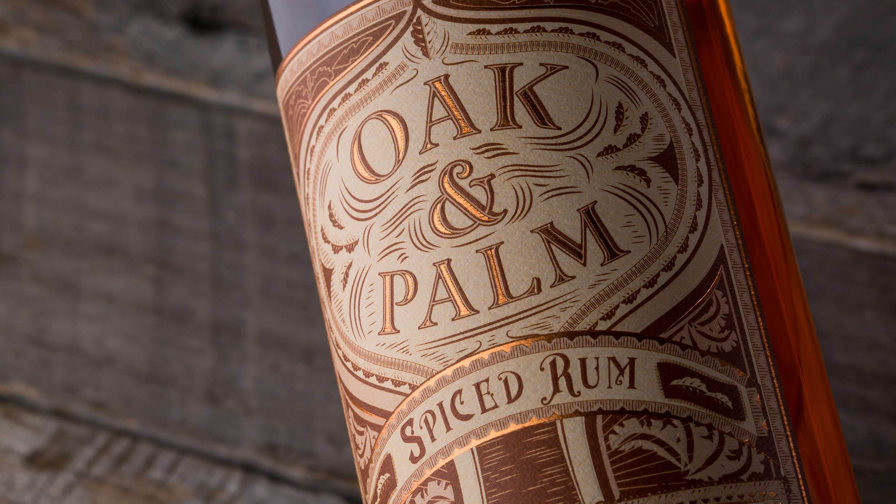
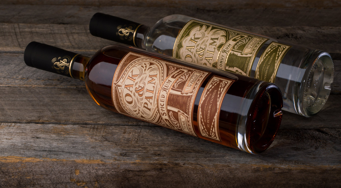
Oak & Palm is a product of St. Petersburg Distillery in St. Petersburg Fl. The direction for this label was to give it a design that felt like it had an interesting story within it. The spiced rum is distilled using spices from the middle east and the coconut rum is distilled using real coconuts. So i wanted the design to invoke a middle eastern feel while staying within the distillery brand, which is Florida in the 1900's.
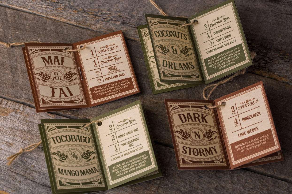
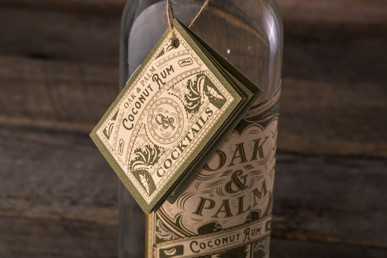
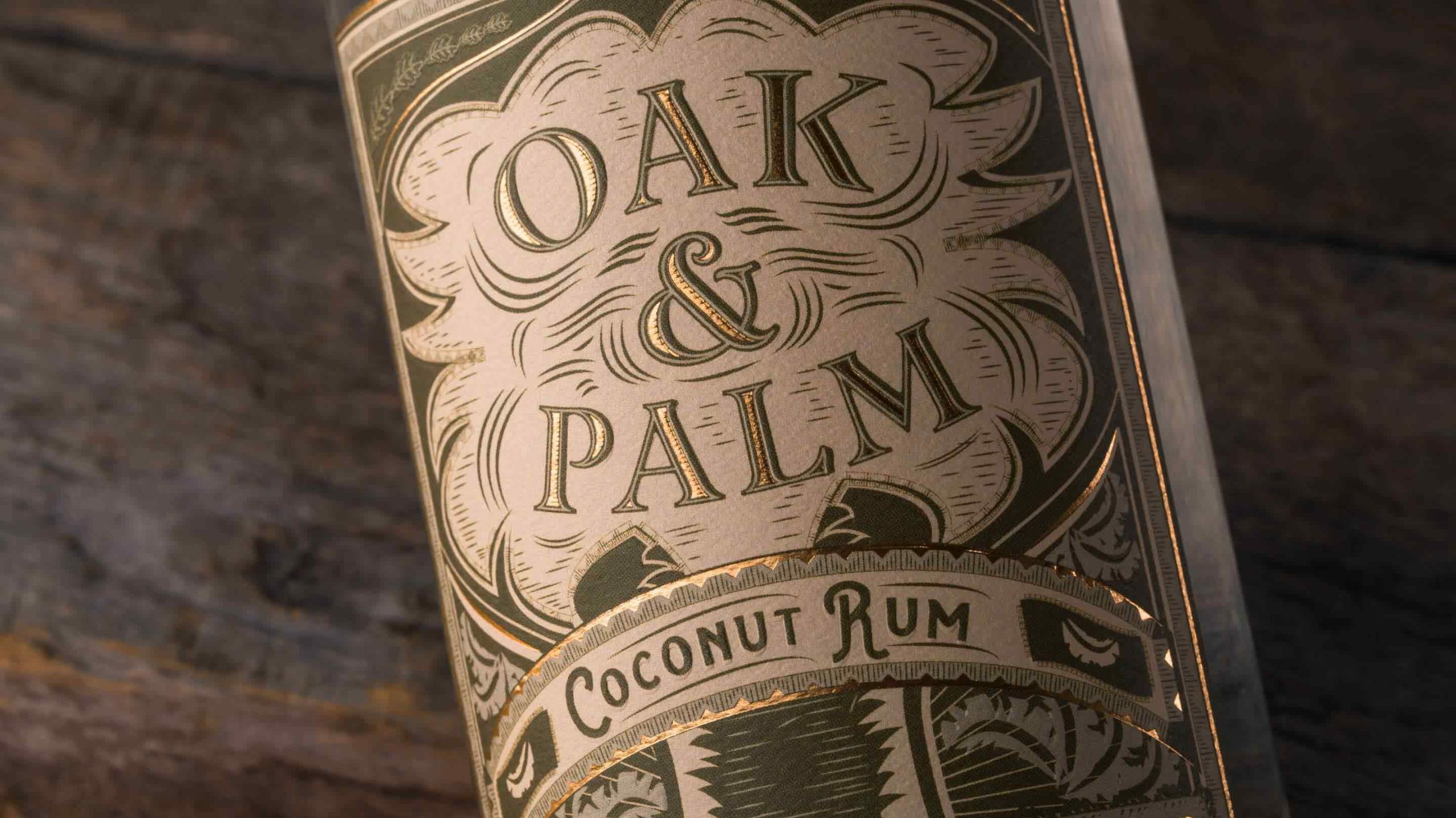
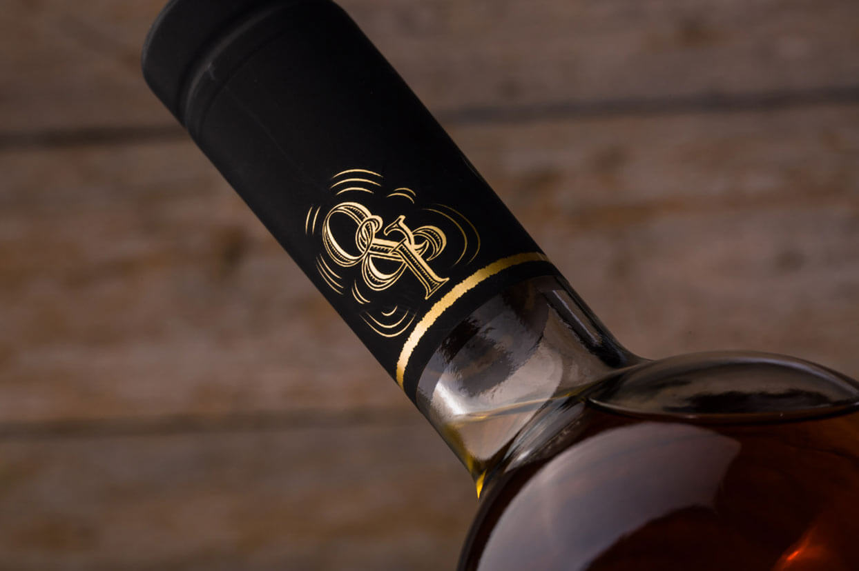
Oak & Palm, are two trees that heavily populate Florida's landscape. The palm representing the beach atmosphere while the oak representing the greener thicker forest portion of Florida. I wanted that to come through in the labels, each one had a tree shape to house the logo. The oak label has a coper foil to give it warmth while the palm label is using a yellow gold to give it a sunny feel.